In a move somewhat uncharacteristic of me, I went out and bought the new 13" MacBook Pro as soon as they became available for purchase. To understand why, we have to go back in time a little bit, back to…
My Old Flame
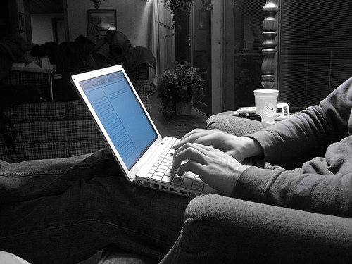
As an undergrad in college, I had a 12" aluminum PowerBook. It was the first Mac (or Apple product of any kind, for that matter) that I had ever owned. By college, I had been using Linux for a few years, so the relatively new UNIX-based OS X (it was only up to 10.2, or “Jaguar”, by that time) was intriguing, and the form factor was ideal for lugging between CS classes.
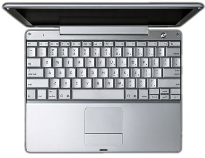
The aluminum PowerBook was a delight. It was light, sturdy, and had a very beautiful LCD screen for its time - especially compared to the old IBM ThinkPad 600E of mine that it replaced (which, by the way, was a tank in its own right). The keyboard reached the length of the body, wasting no space and provided very comfortable full-sized keys. It was the same sized keyboard as the larger PowerBooks; Apple simply made the body big enough to fit it and not a hair wider. Such an efficient use of space.
I was disappointed to see the 12" PowerBook line disappear as quickly as it came - a victim of its own popularity and success. Apple went through major changes, including the nearly unbelievable (but necessary) migration away from the PowerPC architecture to the x86 arch. But the 12" PowerBook never came back.
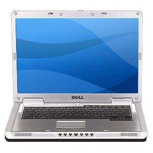
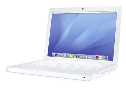
After a stint with a bulky Dell laptop, I came back to Apple with the 13" white MacBook. It’s a nice machine and had the kind of power and battery life that I needed, but I still longed for a true successor to the 12" PowerBook. I often said that all I wanted was for Apple to take the 12" PowerBook, make it widescreen and Core 2 Duo, and throw in the backlit keyboard that eluded the 12" PB.
Then, Apple announced the new 13" MacBook Pro…
Within days, I was preparing my white MacBook to be listed for sale on Craigslist.
Form Factor & Weight
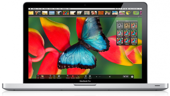
Seeing as I bought this as a replacement for the 13" plastic MacBook, I wasn’t expecting a huge difference in form factor. But while the numbers aren’t impressive on the page, they make quite a difference in hand.
My MacBook weighed 5.2 lbs, and the new 13" MBP weighs 4.5 lbs. It seems as if there’s some threshold between those two numbers, because the MBP has noticeably less “heft”.
Part of the difference is also the sturdiness of the case. Far from unsturdy, the plastic MacBook body still has some give & wiggle like pretty much any other laptop. The aluminum unibody on the MacBook Pro, however, is the epitome of fit and finish. The body has no flex or wiggle to it, and the LED screen stays exactly where you put it.
It has the “chiclet” style keyboard that I was first exposed to on my white 13" MacBook, and have come to really appreciate. From a pure cleanliness standpoint, the fact that the keys don’t create little valleys of crevaces for dust or hair or snack crumbs to go spelunking in is a big plus. I’m also very thrilled to finally have the backlit keys; one of the few features from the PowerBook line which was left off of the 12" PowerBook.
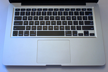
The touchpad is now one big surface with no buttons. Instead, the pad is physically clickable. I was unsure of how I would like this, as I never liked the “tap to click” of Synaptics touchpads on PC laptops. Picking up and re-placing my fingers on the touchpad triggered false clicks constantly, so turning “tapping” off is always the first thing I do after freshly installing Linux or Windows on a PC laptop.
But making the MacBook Pro touchpad click involves actually pushing to make the pad physically “click”. And that makes all the difference in the world. No more false taps. And converting the space that buttons would normally take up into additional touchpad space makes for a HUGE surface area that is simply wonderful. The two-finger scrolling really benefits from the added real estate. It makes casual web browsing with the laptop in your lap (where the machine might not be flat and level like on a desk) a lot more convenient.
Beauty in LED
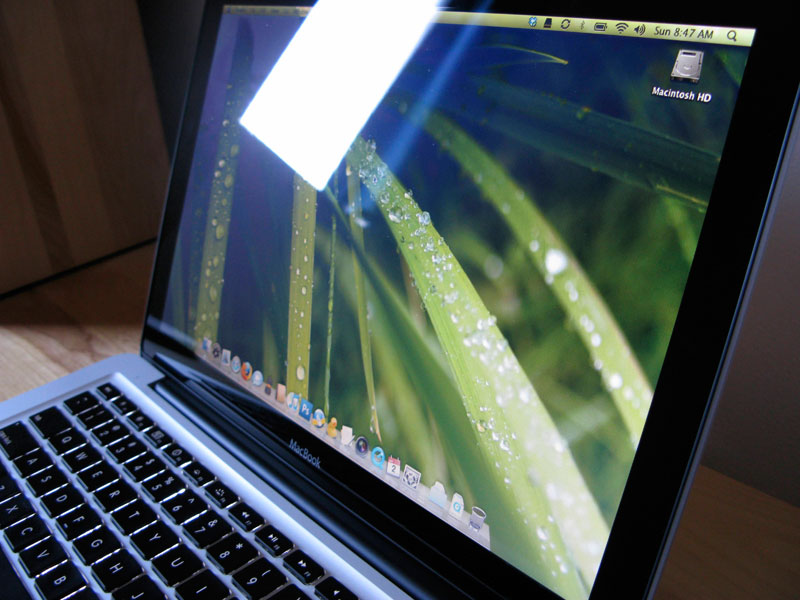
I couldn’t possibly say enough good things about the LED panel in the MBP. It is bright, and crystal clear. LED panels reach instant 100% luminance, as opposed to LCDs which require a bit of “warming up” in order to reach full brightness. It’s a very noticeable difference. It means that dimming the panel to save battery doesn’t leave you with a half-bright screen when you start using it again.
But even compared to a fully warmed-up LCD panel, it’s a night-and-day difference. The LED is just amazingly bright. Like, you walk up to someone that’s using their own laptop, whip out yours, and they say, “holy sh*t, that’s bright!”. Even the damn white Apple logo on the back of the panel shines like it’s trying to pierce through fog and warn ships in the night of the pending coastline.
The beautiful screen definitely requires calibration out of the box. My system, at least, came with a very washed-out image - clearly the result of an overly-high contrast setting. Unfortunately, there isn’t a simple contrast slider to adjust. Fortunately, there is a guided calibration routine that works out pretty well. You must check the “Expert” checkbox, though! Otherwise, you won’t be able to do much besides change the color temperature. With the expert checkbox checked, you go through a series of adjustments where you make the inner solid-colored Apple logo as closely as possible match the surrounding alternating shaded lines in appearance. If you understand how these things work (it helps to look off-center or “blur” your vision, so that the alternating line pattern kind of “blends” together into a single color), you’ll come out the other side with an excellent off-the-cuff color calibration. You can’t do much better without investing in a colorimeter.
Battery
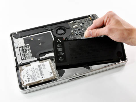
Battery life is what drove me to buy the white MacBook, and I was elated to see that the 13" MacBook Pro got the built-in lithium polymer battery that was, until that point, exclusive to the 17" MBP (the updated 15" MBP that came out alongside the 13" also got the new battery, whereas the previous 15" MBP lacked it).
I don’t know if the battery will last 7 hours the way Apple claims. I do know it lasts a damn long time - long enough to change my usage patterns. I’m not nearly as tethered to the power cord with this laptop as I was even with the white MacBook. I unplug and walk around with it, and don’t feel like I’m living under a countdown clock.
UNIX
 I love UNIX-like OSs. I feel naked without a terminal window and a Bash prompt. Darwin (the open source UNIX OS that the rest of OS X is built on top of) provides a userland that’s mostly based on FreeBSD, but mixes in some GNU and even NetBSD. It’s not bad on its own, but most users from a UNIX background will want to install some tools that aren’t present in Darwin’s base system, or install newer versions than what Darwin comes with.
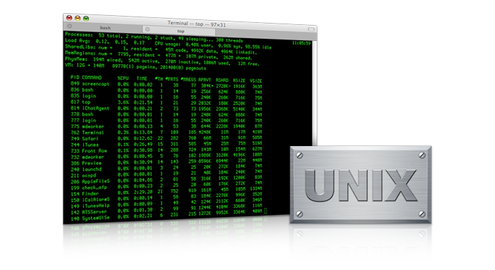 Fortunately, there’s two great projects that make this easy: Fink and MacPorts. Both have their advantages. MacPorts is very straightforward: there’s one single software tree, everything is built from source, and is generally kept the most up-to-date. Fink, on the other hand, has about twice the number of packages offered, provides binaries (pre-compiled apps, meaning you don’t have to wait for the new programs you’re installing to compile - which can take some time) as well as install-from-source. However, with a binary distribution and two separate source distributions (“stable” and “unstable”), it’s a lot less straightforward - especially if you run into an issue that has you scratching your head wondering why you’re not seeing the packages you should be. The two can be run in tandem (Fink installs to /sw, and MacPorts to /opt/local, and both strictly avoid interfering with Darwin’s base system), and that’s how I have my system set up.
The terminal emulator included with OS X is nice enough, but I highly recommend iTerm instead. That and Firefox are my first downloads on a new Mac.
Running Windows … because I have strategy games on Steam that will run on this
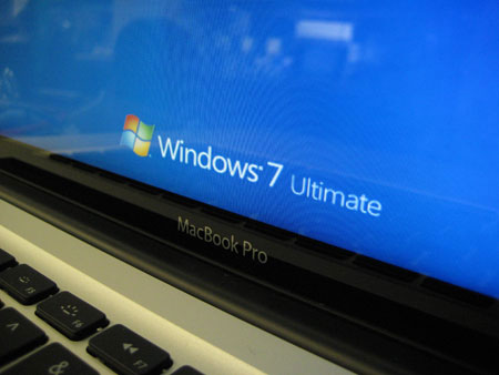
Windows 7 release candidate installs without issue through Boot Camp. Simply use Boot Camp Assistant to carve out a partition, install from CD, then pop in the Leopard install DVD from inside the Windows environment to install all the necessary drivers.
If you want to be able to choose between OS X and your Boot Camp OS at boot time, install rEFIt.
The Apple Store Experience
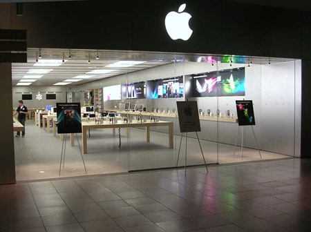
I’m always uncomfortable around computer salesmen. Particularly at an Apple Store, where the average clientele isn’t expected to be programmers, system builders, or UNIX geeks, let alone all three. The store is geared to serve normal people, as well it should be.
But it did leave me wanting to avoid having to sit through a sales pitch that’s scripted for the tech-unsavvy-but-OMG-shiny crowd. It meant walking into the store and basically pointing at the 13" MacBook Pro and saying, “I want to buy this one. 2.26 GHz. Go get it.” But not quite so gruff. (Also, putting the Terminal icon in some display machines' docks. Just helping them put their best foot forward).
I will say one thing for the Apple Store - I’ve never overheard the kind of completely falsified garbage that I used to hear salesmen at CompUSA say to customers (before that company came crashing down, leaving good ol' Fresno with pretty much nowhere to go for computer parts).